Benjamin Brown
Lead Product Designer
Where
user experience
meets
design craft
Nationwide Building Society
Contact Us
2016
-
2017
Help the customer find the right support, first time. Surface relevant support content, enabling them stay within their channel of choice.
Help the customer find the right support, first time. Surface relevant support content, enabling them stay within their channel of choice.
Help the customer find the right support, first time. Surface relevant support content, enabling them stay within their channel of choice.
Project Detail
Success Overview

36%
increase in csat scores
45%
reduction in endpoints
10 weeks
from mvp to launch
Where do we start?
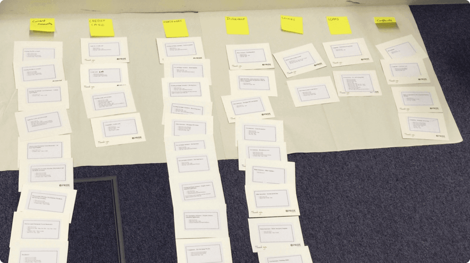
After a large content audit of the phone numbers shown to customers, of which there were 160, we card sorted the results to decipher whether we had repetition and where we could afford to combine any or remove them if they were no longer needed. We drastically reduced the phone numbers down to 72 accurate results, which gave us a much cleaner dataset to start working with.
Displaying the data
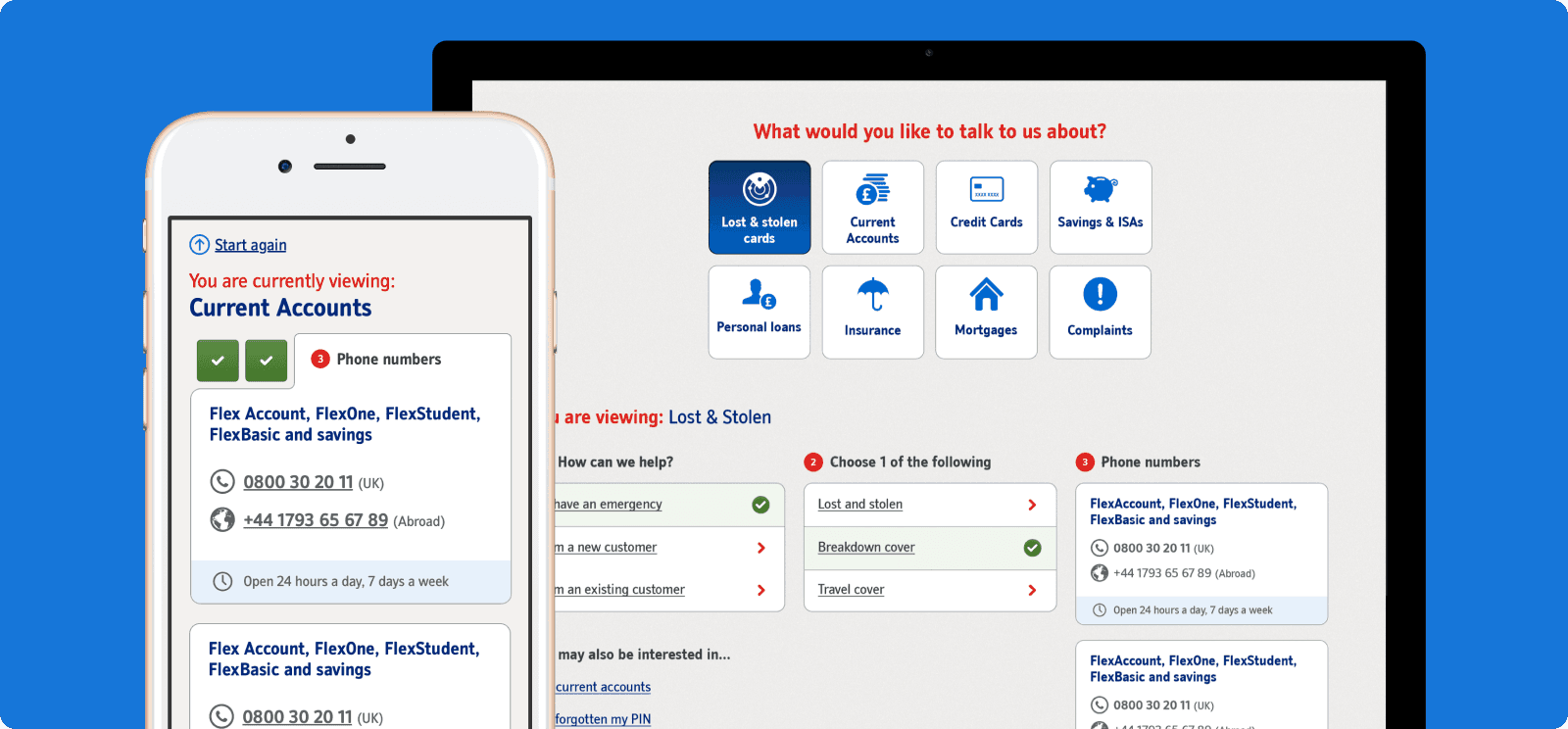
There are a number of key pieces of information that need to be displayed to a customer when they reach any end point (phone number) such as international numbers and numbers for users with accessibility requirements. The issue with the previous version was firstly the amount of numbers displayed at any one time but also the visual hierachy - it was impossible to see what numbers sat with which categories at a glance.
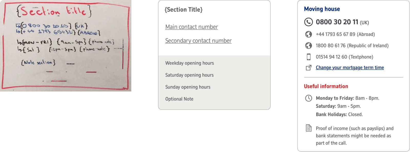
The benefits of cards
✓ Scanable
✓ Modular
✓ Consistent
✓ Interactive
We use cards in every day life, whether it be a drivers licence, or the nutritional data displayed on the back of a box of cereal. People are used to seeing them and having the information laid out in a scanable format makes for much less cognitive load on the user.
A one week MVP
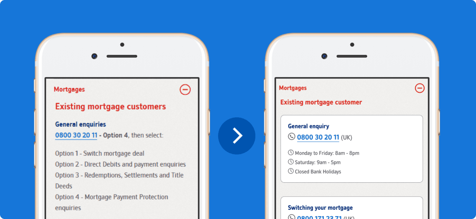
With only minor amends to the cards visuals, and a better categorisation using our newly collated data set, we were able to increase Customer Satisfaction by 6%... However, over the course of our indepth analysis we'd thought of so many ways to positively impact the customer experience, that we simply were not happy enough with leaving the solution where it was.
Enhancements and success
What we'd produced so far did the job, but it still heavily relied on the user being able to surface the right number for themselves which had proved problematic in testing and was re-enforced by our Customer Satisfaction scores.
Devising a way of hand-holding the user and progressively disclosing the correct number first time was what we knew we wanted to achieve, we just needed to work out how.

We noticed early on that a large percentage of our new categories had end points in multiples of 3, these numbers could often be split down into numbers for 'new' and 'existing' customers. It took a few rounds of whiteboard session and iterating user flows but we eventually ended up with a system that progressively disclosed no more than 3 phone numbers to a customer, after asking no more than 3 questions.
Thinking mobile first
We knew that a large portion of customers accessing the 'call us' page were visiting on a mobile device, which stands to reason. I wanted to design a UI that felt totally at home on mobile with big tactile hit areas and breathable UI elements, but didn't want it to feel lost on a desktop device either. The UI responds across various breakpoints to really make the best of the space available and the ability to go back a number of steps in one just tap, as well as being able to start a search from scratch quickly means the user is never more than 2 clicks away from finding a telephone number.
Measuring success
We ran the test as an A/B against our MVP solution for 5 weeks and it returned a staggering 36% uplift in customer satisfaction. This project was successfully delivered in 10 weeks, in a highly collaborative agile fashion.
Project Detail
Success Overview
36%
increase in csat scores
45%
reduction in endpoints
10 weeks
from mvp to launch
Where do we start?
After a large content audit of the phone numbers shown to customers, of which there were 160, we card sorted the results to decipher whether we had repetition and where we could afford to combine any or remove them if they were no longer needed. We drastically reduced the phone numbers down to 72 accurate results, which gave us a much cleaner dataset to start working with.
Displaying the data
There are a number of key pieces of information that need to be displayed to a customer when they reach any end point (phone number) such as international numbers and numbers for users with accessibility requirements. The issue with the previous version was firstly the amount of numbers displayed at any one time but also the visual hierachy - it was impossible to see what numbers sat with which categories at a glance.
The benefits of cards
✓ Scanable
✓ Modular
✓ Consistent
✓ Interactive
We use cards in every day life, whether it be a drivers licence, or the nutritional data displayed on the back of a box of cereal. People are used to seeing them and having the information laid out in a scanable format makes for much less cognitive load on the user.
A one week MVP
With only minor amends to the cards visuals, and a better categorisation using our newly collated data set, we were able to increase Customer Satisfaction by 6%... However, over the course of our indepth analysis we'd thought of so many ways to positively impact the customer experience, that we simply were not happy enough with leaving the solution where it was.
Enhancements and success
What we'd produced so far did the job, but it still heavily relied on the user being able to surface the right number for themselves which had proved problematic in testing and was re-enforced by our Customer Satisfaction scores.
Devising a way of hand-holding the user and progressively disclosing the correct number first time was what we knew we wanted to achieve, we just needed to work out how.
We noticed early on that a large percentage of our new categories had end points in multiples of 3, these numbers could often be split down into numbers for 'new' and 'existing' customers. It took a few rounds of whiteboard session and iterating user flows but we eventually ended up with a system that progressively disclosed no more than 3 phone numbers to a customer, after asking no more than 3 questions.
Thinking mobile first
We knew that a large portion of customers accessing the 'call us' page were visiting on a mobile device, which stands to reason. I wanted to design a UI that felt totally at home on mobile with big tactile hit areas and breathable UI elements, but didn't want it to feel lost on a desktop device either. The UI responds across various breakpoints to really make the best of the space available and the ability to go back a number of steps in one just tap, as well as being able to start a search from scratch quickly means the user is never more than 2 clicks away from finding a telephone number.
Measuring success
We ran the test as an A/B against our MVP solution for 5 weeks and it returned a staggering 36% uplift in customer satisfaction. This project was successfully delivered in 10 weeks, in a highly collaborative agile fashion.
Where
user experience
meets
design craft