
Benjamin Brown
Lead Product Designer
Where
user experience
meets
design craft
Nationwide Building Society
Current Account Origination Platform
2017
-
2019
A straightforward, personalised and engaging account opening experience that embraces self-service and education.
A straightforward, personalised and engaging account opening experience that embraces self-service and education.
A straightforward, personalised and engaging account opening experience that embraces self-service and education.
Project Detail
Success Overview

99%
paperless comms uptake
98%
containment rates
2 mins
avg. account opening
Where do we start
Prior to this project, a hugely prohibitive step in people opening accounts successfully online was the inability to provide their ID digitally meaning un-welcomed visits into a physical branch were rising. In a world where everything is online-first, this was becoming an ever increasing sticking point for customers.
Working alongside McKinsey and Sapient, we embarked on changing the legacy ways of working that had long been established as 'normal' within Nationwide Building Society.
'FlexOne' - the 13-17 year old bank account that Nationwide provides seemed like the perfect place to start this large scale transformation largely due to the fact that a form of ID was always required to be taken into a Nationwide branch to complete the account opening. If we could solve this for the people that always need to visit the branch, then the knock on effect to older customers would be simpler to provide.
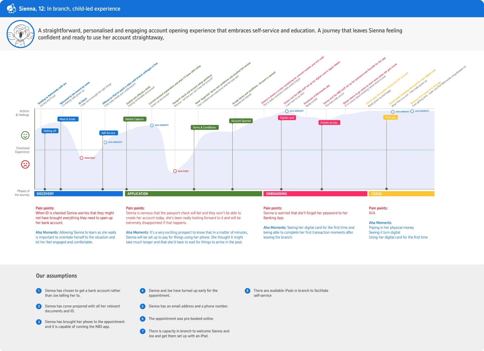
Mapping the issue
We spent a large amount of time mapping the typical experiences of our chosen personas, trying to understand their emotional experience (both good and bad) by looking at how they usually go from discovering and choosing to bank with Nationwide, to what their onboarding experience looks like once they engage with the society.
Sienna, 12 years old
Felicity, 16 years old
Joe (Parent), 49 years old
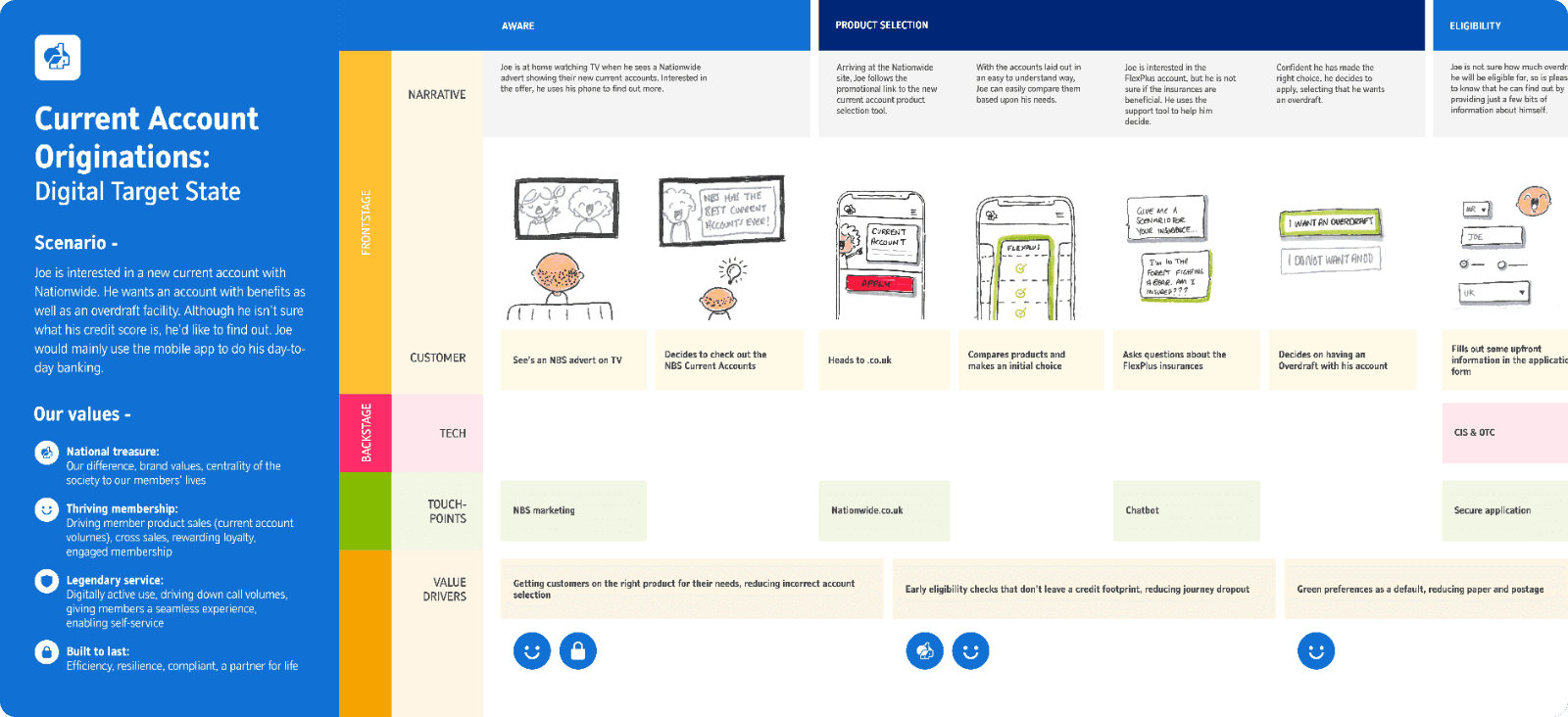
Target State
We created a target state blueprint to help us understand where we wanted to be in 24 months time. This encapsulated both business requirements (e.g regulated 2-Factor Authentication) as well as assumptive user needs (e.g instant account access, digital cards), from these larger more grandiose ideas we were able to validate their importance and sense of necessity to our users.

Customer validation
We ran a series of user interviews with children and their parents ranging from 13 to 17 years of age.
We had a number of upfront assumptions that we pieced together in a prototype to help us understand what resonated well with children.
A few of the assumptions we made were:
Children would want to use a 'more fun' sub-brand of Nationwide
They don't want technical jargon
They want to customise their card / account
We soon realised that actually, one of the things children wanted by opening the account was the feeling of being 'grown-up'. They didn't want to interact with a 'child friendly' sub-brand, nor customise their cards because opening a bank account felt like a coming-of-age task where they wanted to be treated in a more mature way.
Over the course of a few months of regular testing sessions, we were able to strike a really good balance between the children not being overwhelmed with banking jargon they hadn't heard before as well as an interface that allowed them to feel like they were being validated as 'young adults' by opening an account.
Interface design
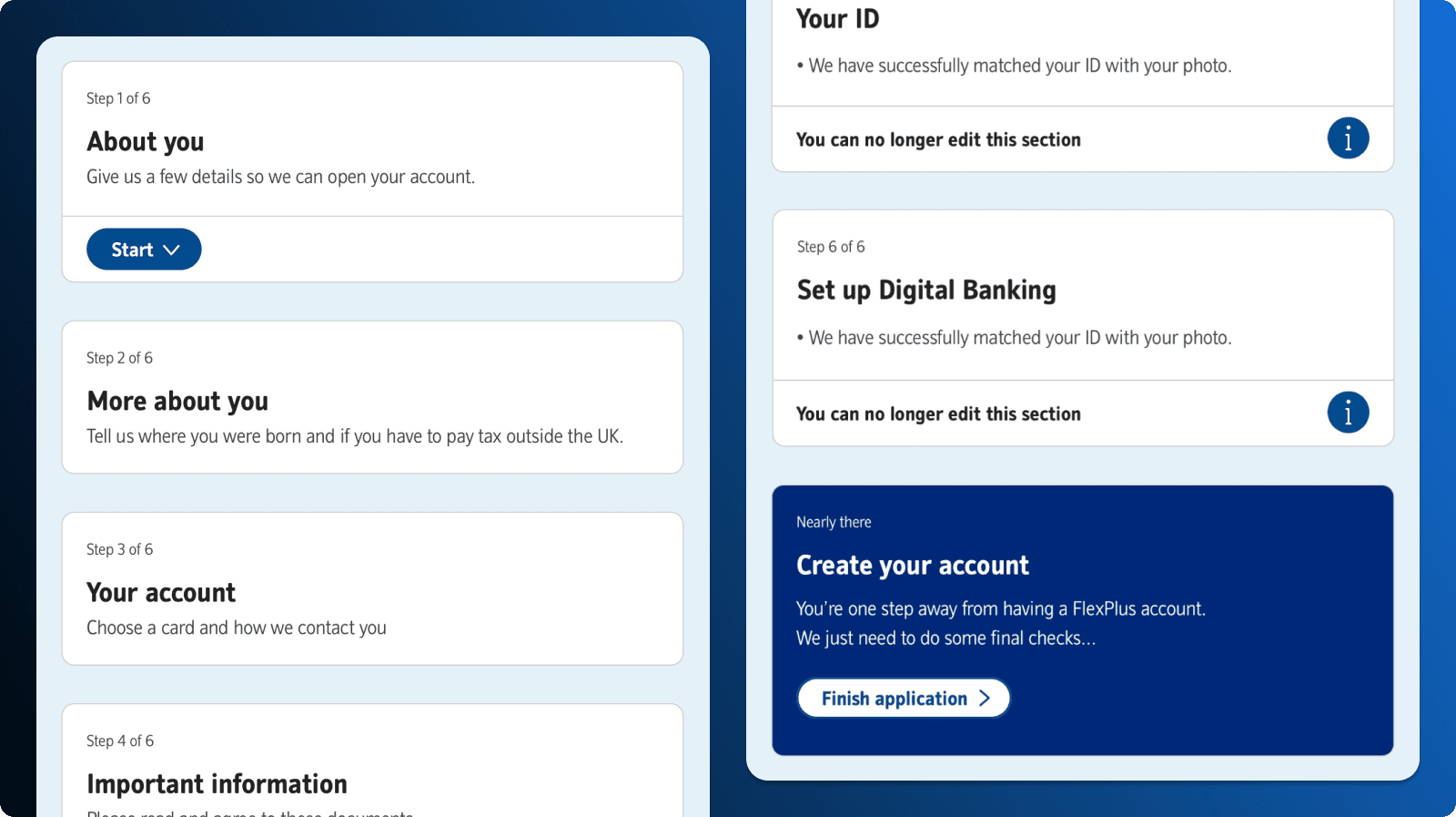
One comment we were met with a number of times was that it felt like the time to completion took a long time. Granted, there are many tasks to complete, but this was also split across multiple pages that each housed a varying number of questions.
We iterated on an interface where we moved from a multi-page account opening form, to a single form that clearly laid out all of the sections the customer would be asked to fill in. Although the number of questions hadn't changed, the pacing of the form had changed drastically by containing it all on one screen. This was perceived as a marked improvement in time to completion by the young adults.
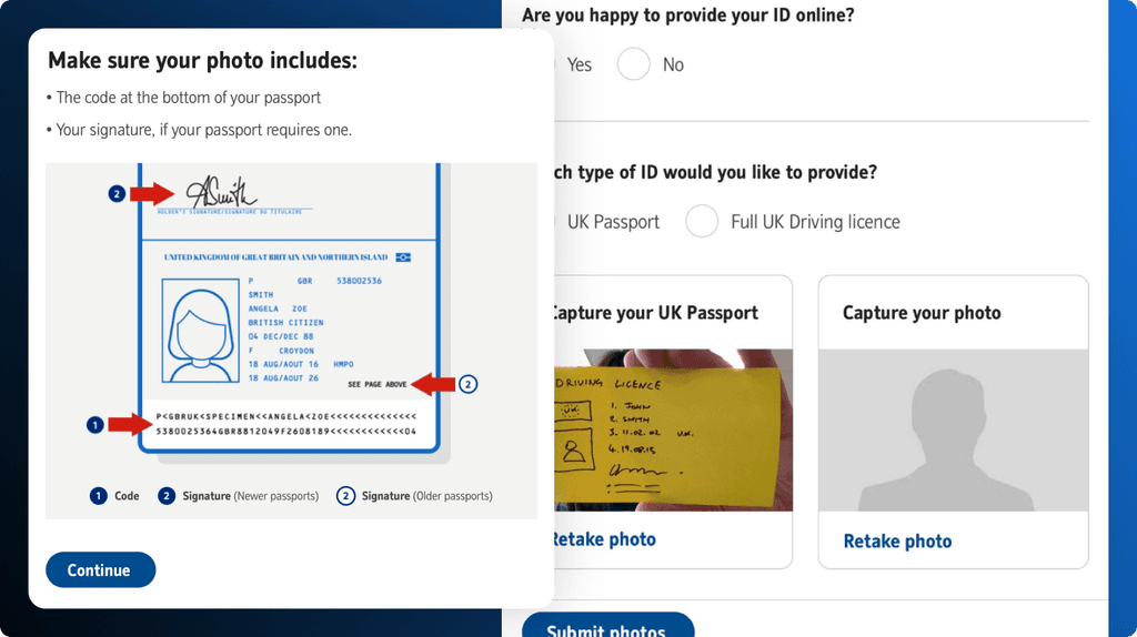
Digital Identification
One of the biggest obstacles within this project was how we allow users to upload their ID digitally to allow the risk teams and Nationwide to instantly allow accounts to be opened. We brought on a 3rd party partner to handle the technology, meaning that we needed to craft an interface that felt intuitive and could work well across mobile and desktop touchpoints.
Terms and Conditions
We had a huge success with the way we presented our Terms and Conditions and other legal 'must-read' docs, and this was due to the nature of the agile working and our weekly transparency sessions with the legal and underwriting teams to make sure that they bought into what the problem space was.
We rationalised that 13-17 year olds (and pretty much the majority of other customers) are extremely reluctant to spend time reading lengthy documents filled with jargon that even the most adept reader would struggle to comprehend. As a risk adverse business it was an uphill battle to encourage them to shift their focus but after many rounds of presenting them synthesised test data they soon came to realise that it was in the users interests to make the terms and conditions an optional read on signing up for an account. As ALL customers receive a copy of the documents physically in the post, it was understood that as long as we give users the option to read them when signing up, we did not have to make it mandatory an more. A big time saver for users of all ages!

Here you can watch a short video of one end-to-end journey for the account opening flow.
Project Detail
Success Overview
99%
paperless comms uptake
98%
containment rates
2 mins
avg. account opening
Where do we start
Prior to this project, a hugely prohibitive step in people opening accounts successfully online was the inability to provide their ID digitally meaning un-welcomed visits into a physical branch were rising. In a world where everything is online-first, this was becoming an ever increasing sticking point for customers.
Working alongside McKinsey and Sapient, we embarked on changing the legacy ways of working that had long been established as 'normal' within Nationwide Building Society.
'FlexOne' - the 13-17 year old bank account that Nationwide provides seemed like the perfect place to start this large scale transformation largely due to the fact that a form of ID was always required to be taken into a Nationwide branch to complete the account opening. If we could solve this for the people that always need to visit the branch, then the knock on effect to older customers would be simpler to provide.
Mapping the issue
We spent a large amount of time mapping the typical experiences of our chosen personas, trying to understand their emotional experience (both good and bad) by looking at how they usually go from discovering and choosing to bank with Nationwide, to what their onboarding experience looks like once they engage with the society.
Sienna, 12 years old
Felicity, 16 years old
Joe (Parent), 49 years old
Target State
We created a target state blueprint to help us understand where we wanted to be in 24 months time. This encapsulated both business requirements (e.g regulated 2-Factor Authentication) as well as assumptive user needs (e.g instant account access, digital cards), from these larger more grandiose ideas we were able to validate their importance and sense of necessity to our users.
Customer validation
We ran a series of user interviews with children and their parents ranging from 13 to 17 years of age.
We had a number of upfront assumptions that we pieced together in a prototype to help us understand what resonated well with children.
A few of the assumptions we made were:
Children would want to use a 'more fun' sub-brand of Nationwide
They don't want technical jargon
They want to customise their card / account
We soon realised that actually, one of the things children wanted by opening the account was the feeling of being 'grown-up'. They didn't want to interact with a 'child friendly' sub-brand, nor customise their cards because opening a bank account felt like a coming-of-age task where they wanted to be treated in a more mature way.
Over the course of a few months of regular testing sessions, we were able to strike a really good balance between the children not being overwhelmed with banking jargon they hadn't heard before as well as an interface that allowed them to feel like they were being validated as 'young adults' by opening an account.
Interface design
One comment we were met with a number of times was that it felt like the time to completion took a long time. Granted, there are many tasks to complete, but this was also split across multiple pages that each housed a varying number of questions.
We iterated on an interface where we moved from a multi-page account opening form, to a single form that clearly laid out all of the sections the customer would be asked to fill in. Although the number of questions hadn't changed, the pacing of the form had changed drastically by containing it all on one screen. This was perceived as a marked improvement in time to completion by the young adults.
Digital Identification
One of the biggest obstacles within this project was how we allow users to upload their ID digitally to allow the risk teams and Nationwide to instantly allow accounts to be opened. We brought on a 3rd party partner to handle the technology, meaning that we needed to craft an interface that felt intuitive and could work well across mobile and desktop touchpoints.
Terms and Conditions
We had a huge success with the way we presented our Terms and Conditions and other legal 'must-read' docs, and this was due to the nature of the agile working and our weekly transparency sessions with the legal and underwriting teams to make sure that they bought into what the problem space was.
We rationalised that 13-17 year olds (and pretty much the majority of other customers) are extremely reluctant to spend time reading lengthy documents filled with jargon that even the most adept reader would struggle to comprehend. As a risk adverse business it was an uphill battle to encourage them to shift their focus but after many rounds of presenting them synthesised test data they soon came to realise that it was in the users interests to make the terms and conditions an optional read on signing up for an account. As ALL customers receive a copy of the documents physically in the post, it was understood that as long as we give users the option to read them when signing up, we did not have to make it mandatory an more. A big time saver for users of all ages!
Here you can watch a short video of one end-to-end journey for the account opening flow.
I would highly recommend Ben if you are looking for well reasoned creative challenge, an individual that is always willing to go above and beyond for the team and someone who will always go the extra mile to hit a deadline without compromising on quality.
I would highly recommend Ben if you are looking for well reasoned creative challenge, an individual that is always willing to go above and beyond for the team and someone who will always go the extra mile to hit a deadline without compromising on quality.
I would highly recommend Ben if you are looking for well reasoned creative challenge, an individual that is always willing to go above and beyond for the team and someone who will always go the extra mile to hit a deadline without compromising on quality.
Geraldine Maringo
Chief Product Owner, Nationwide

Where
user experience
meets
design craft